Postscript.io
CATEGORY: production
SERVICES: pre-production / on-set supervising / edit / vfx / compositing / color grading / sound design
01. The Goal
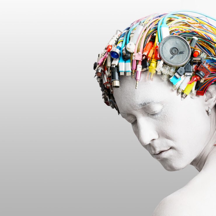
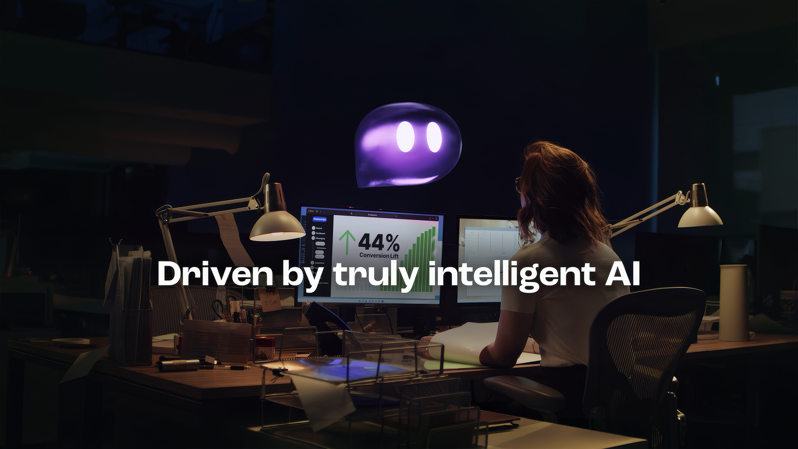
The goal is to create a memorable ad with surrealism and humor, encouraging viewers to share it beyond its messaging.
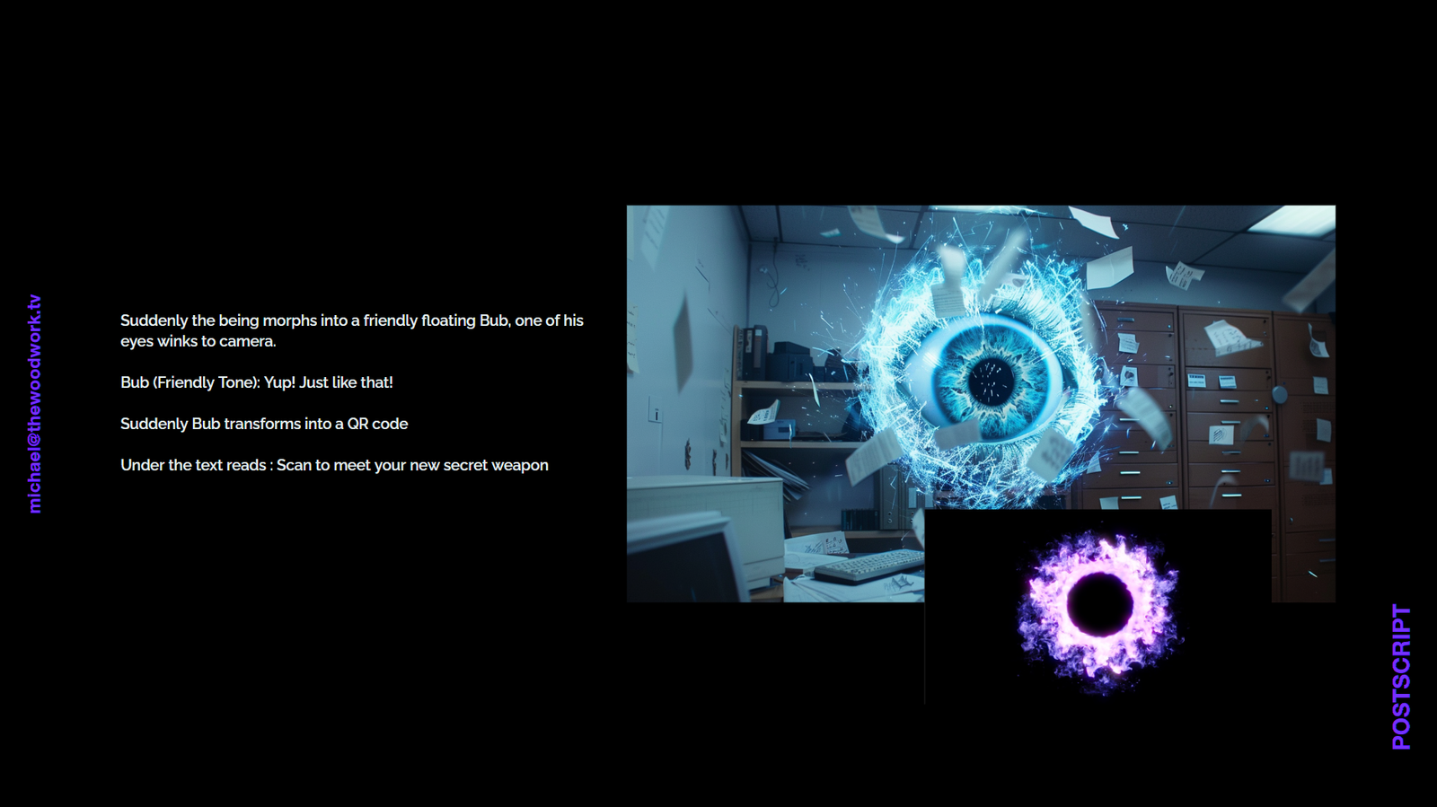
The product will be personified as a surreal character, inspired by campaigns like Skittles and Panda Cheese.
By focusing the narrative, the commercial will reduce unnecessary variables, allowing the budget to be more effectively allocated to enhance on-screen production.
This approach aims to create a high-quality, prestige-tier commercial.
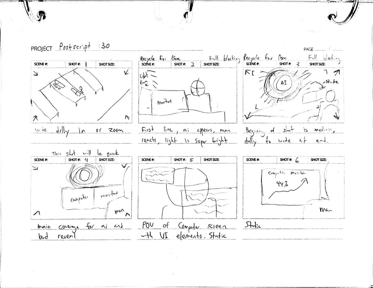
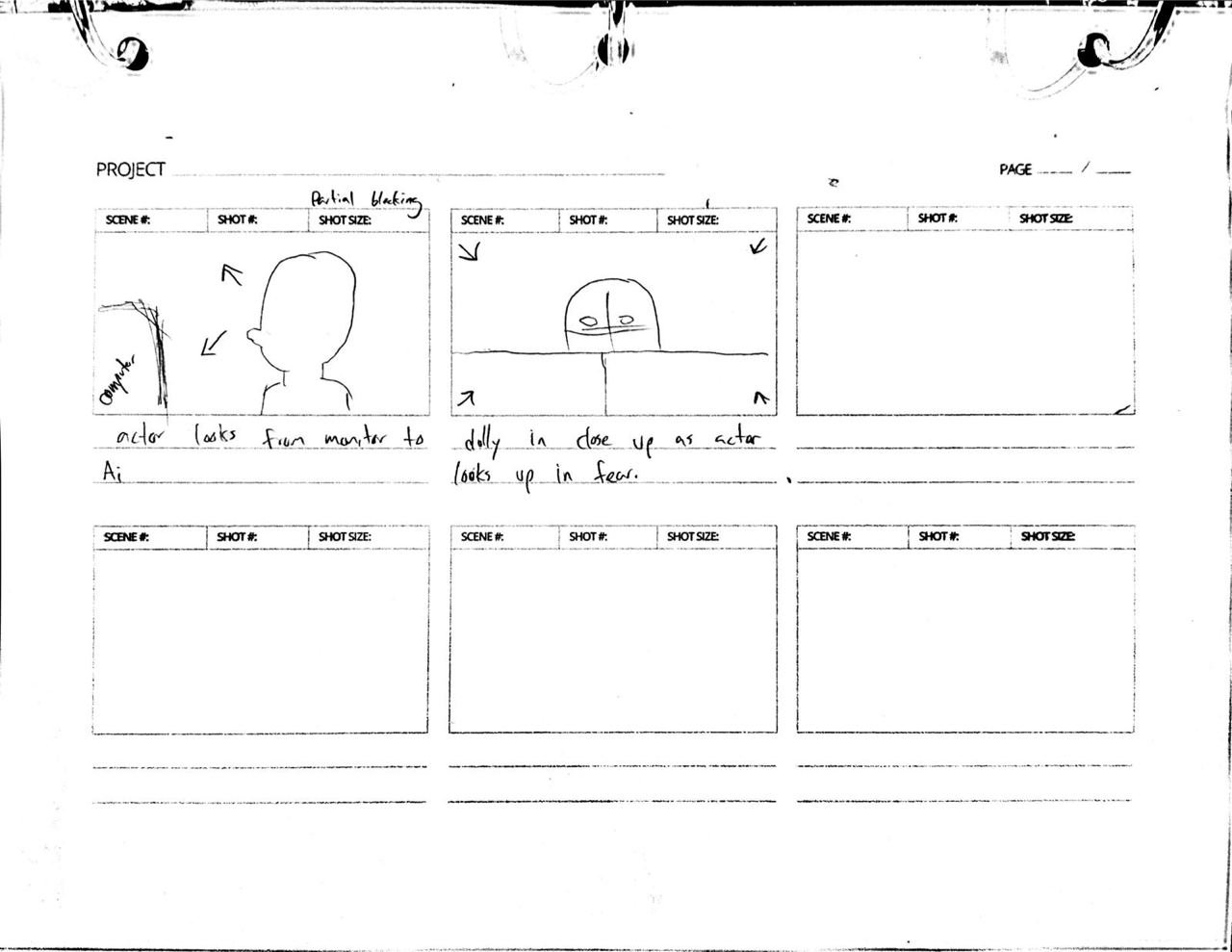
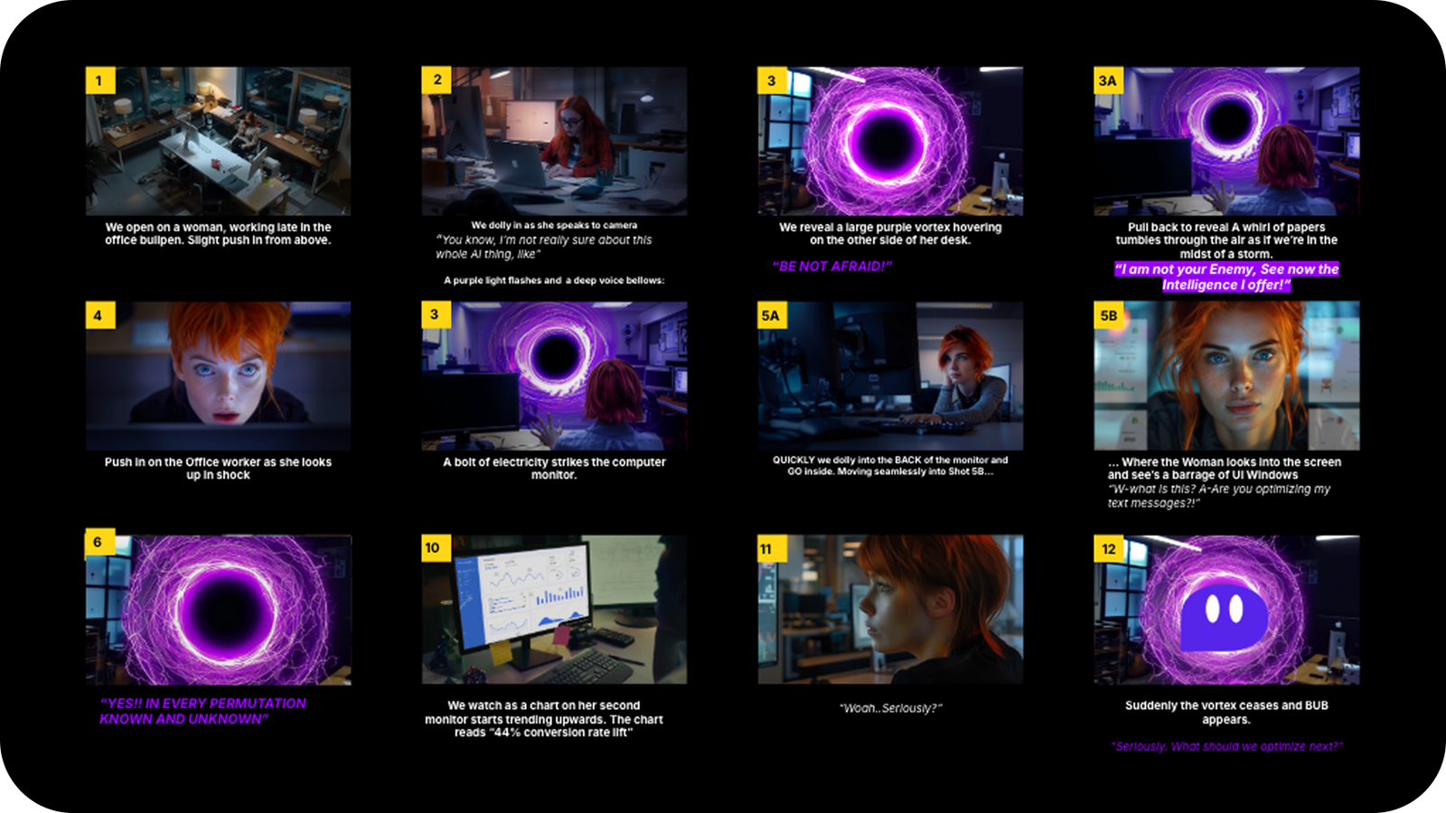
02. Storyboard
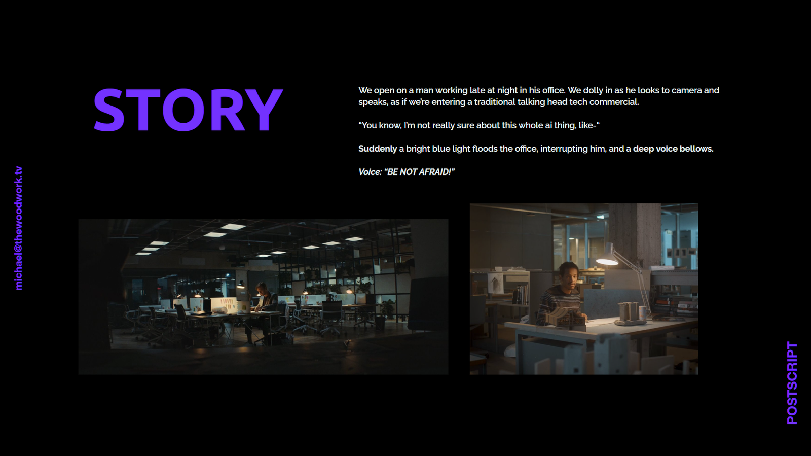
Our team developed the storyboard and visual concept for this project, shaping its tone and creative direction.
Through close collaboration and a focus on storytelling, we helped transform the initial idea into a cohesive visual narrative. Our approach combined cinematic thinking with strategic design, ensuring every frame supported the overall message and brand identity.
03. Workflow
To develop the CG portal, character and their subsequent addition to the scene, we followed this pipeline:
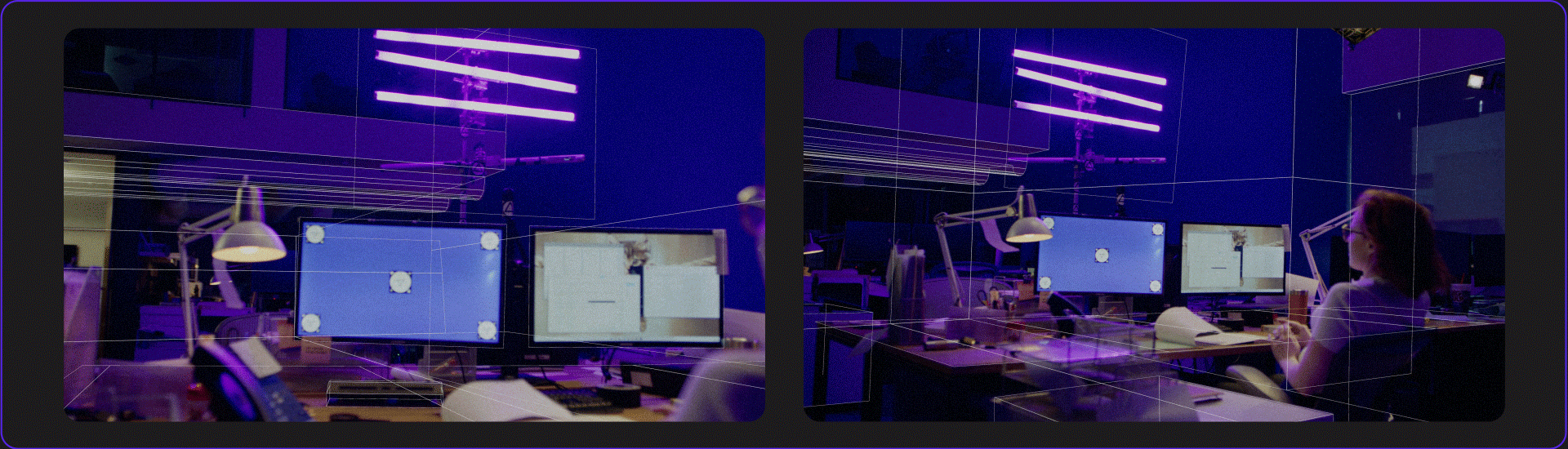
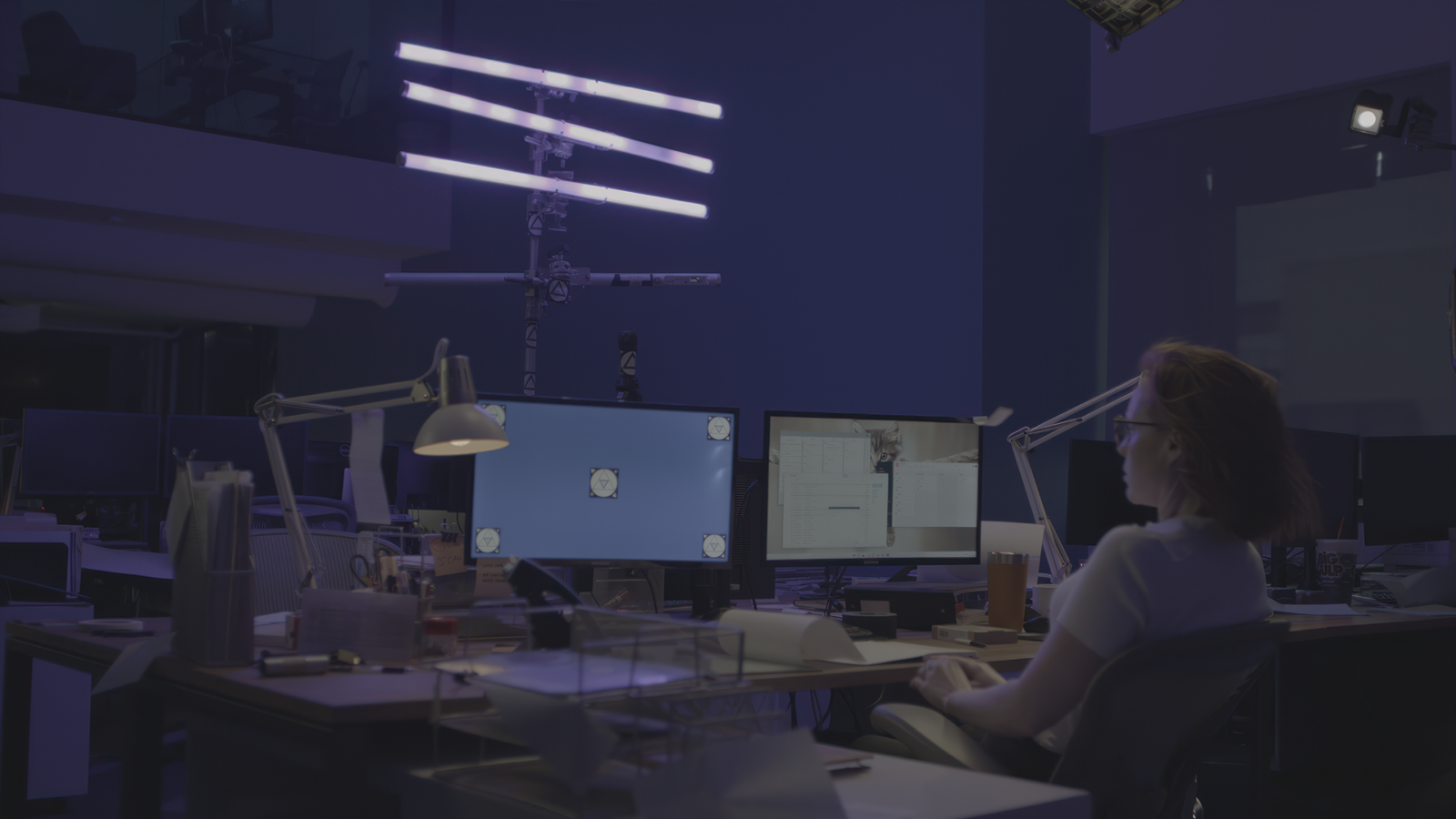
3d camera tracking
The first task for us was 3D tracking the camera and recreating the geometries of the scene to then apply it to the wedge and projection of a number of graphic elements of the background. Such as flying sheets of paper, dust and haze.
For this task we used 3D Equalizer, where we created cameras for all scenes. Then, in Nuke, we used Model Builder to create the geometry of most of the objects in the scenes.
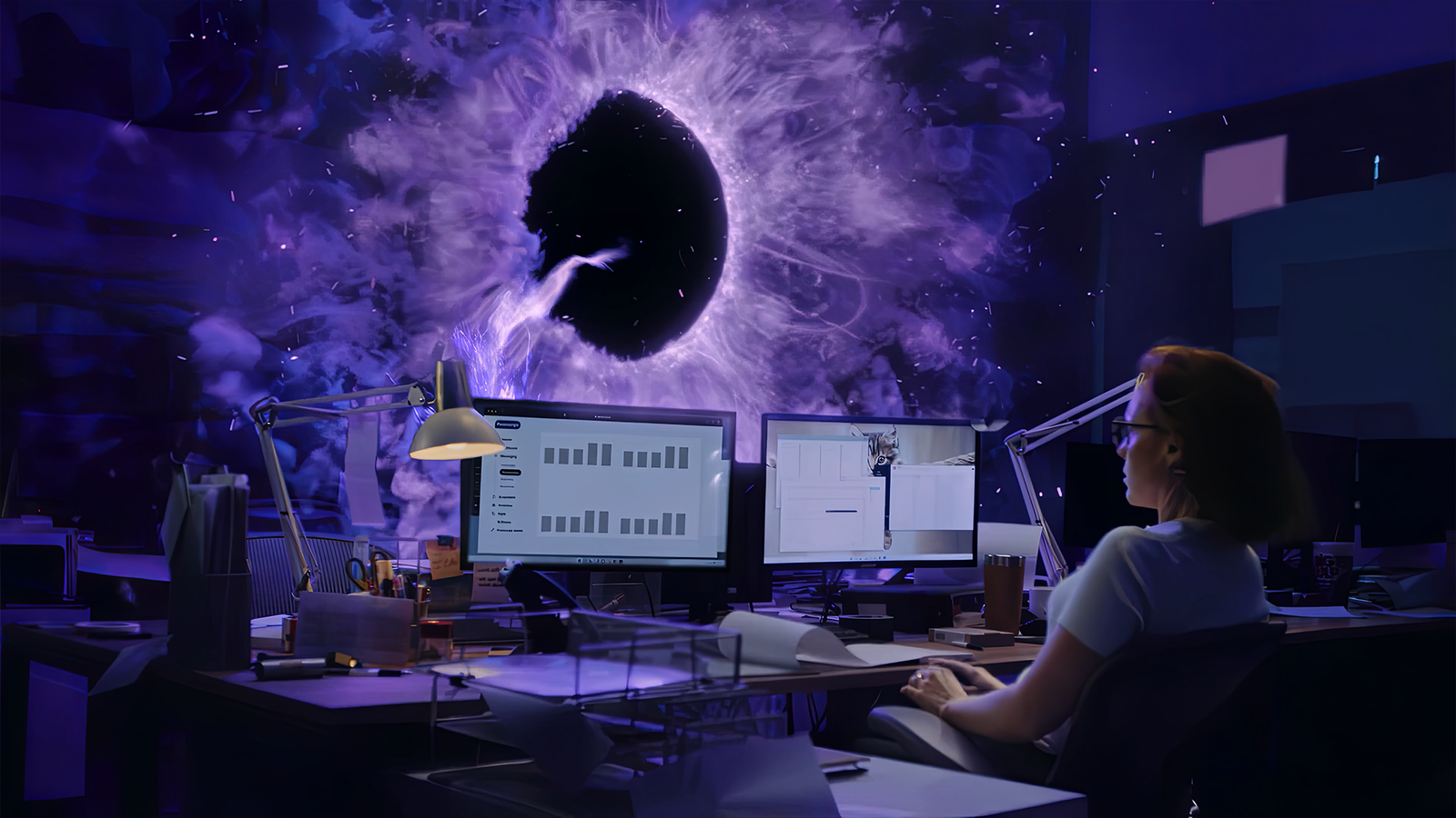
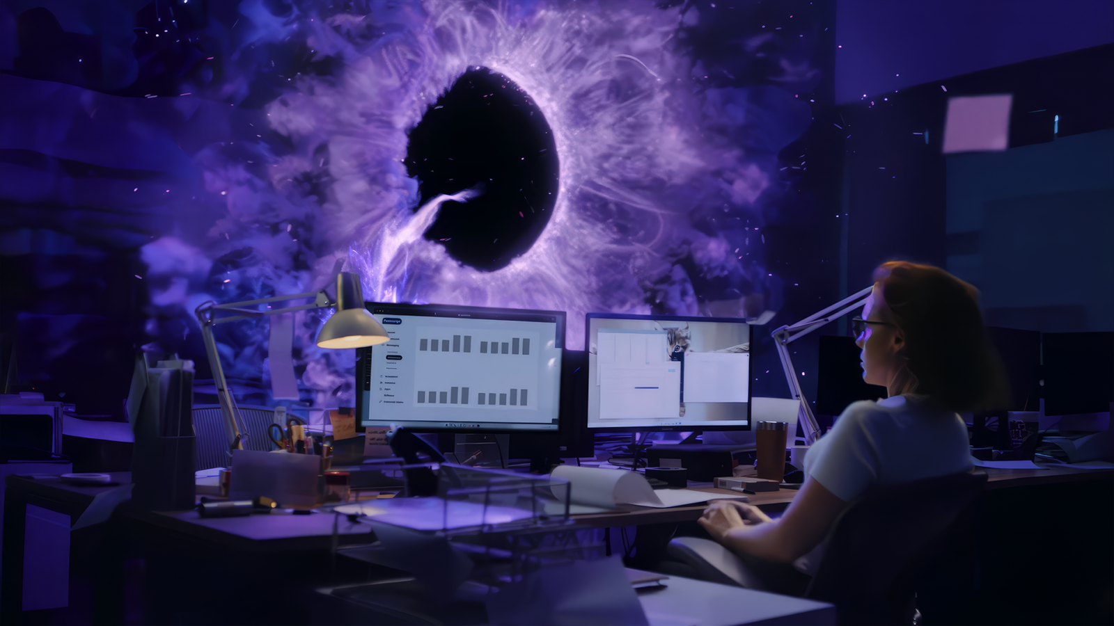
CG Portal & Character Dev
Our team designed and developed the surreal CG portal and character that became the core visual elements of the project.
The goal was to blend realistic motion with stylized, almost dreamlike behavior — creating a balance between humor, intrigue, and visual impact.
We built the assets with a focus on expressive movement and texture, ensuring they integrated naturally into the filmed environment while maintaining a distinctive, memorable style.
Cleanup & Roto
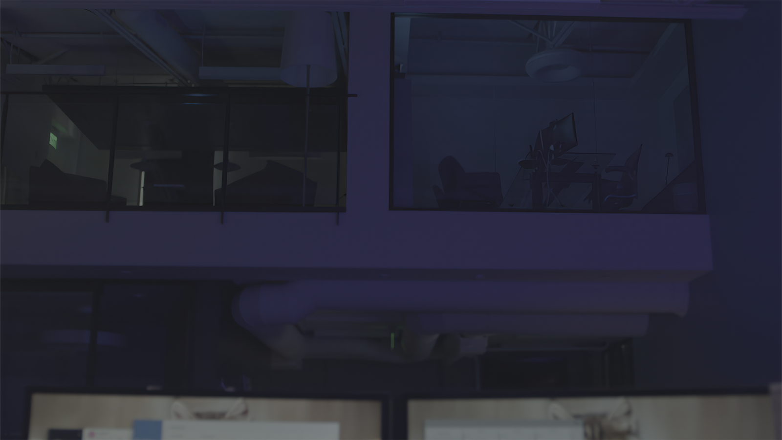
In almost all shots, the camera’s view included lighting fixtures and reflections of the film crew on glass surfaces and screens. Having prepared neat cleanplates, we projected them onto the pre-prepared 3D geometry.
Then it was just a matter of making Roto-masks for the foreground objects to bring them above the cleanplate patches.
To create the masks we used both frame-by-frame mask animation and more convenient and faster methods, such as Luma keying.
CG Compositing
After getting clean scenes, a set of masks and finished CG renders of the portal and character, we assembled each of the frames, placing all the graphics in the right parts of the space.
Then we started compositing, and by adding distortions, defocuses, glows, working with 3D passes and colours of separate parts of the renders – we achieved maximum realism of CG elements and illusion of their real presence inside the filmed location.
Color correction & grading
Having collected the frames extracted from Nuke in the DaVinci Resolve project, we made the final colour correction according to the colour palette received from the client in advance.
Special attention was paid to the skintone, as the client wanted to see the characters as close as possible to the references from the clips of the early 2000s.
Although the result of colour correction does not coincide with our colour preferences, the task was completed as quickly and efficiently as possible.
Following this Pipeline, we did the project in just a week. Despite the sleepless nights, we are very happy to have worked on such an interesting project!
04. Matchmove
We use 3D Equalizer4 in our work. When working on this project, we had two professional matchmoving artists, each of whom has more than 20 major advertising projects and countless smaller ones to their credit, and two mid-level artists, who were mostly involved in creating 3D scenes based on ready-made camera tracking.
The information on the camera and lenses used in the shoot was lost by the supervisor, who, in the end, was not present on the project. But, globally, it didn’t play any role and didn’t become a problem. Undistortion turned out to be neatly done due to vertical and horizontal lines in the scene.
In total, all nine scenes were made in less than 4 hours!
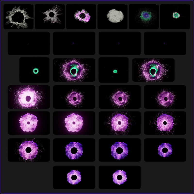
05. CG Portal & Character creation
The development of the portal was very difficult. The references were not approved for a long time, so the Houdini specialist guessed what the customer would like and what would not. Then we tried dozens of distortion variants to create a visual effect of plasma, but, later, we left this task to the compositing stage.
The conclusion for our team was the decision to never work without references or a clear specification. I have never seen more stress than the simulation artist experienced in my work.
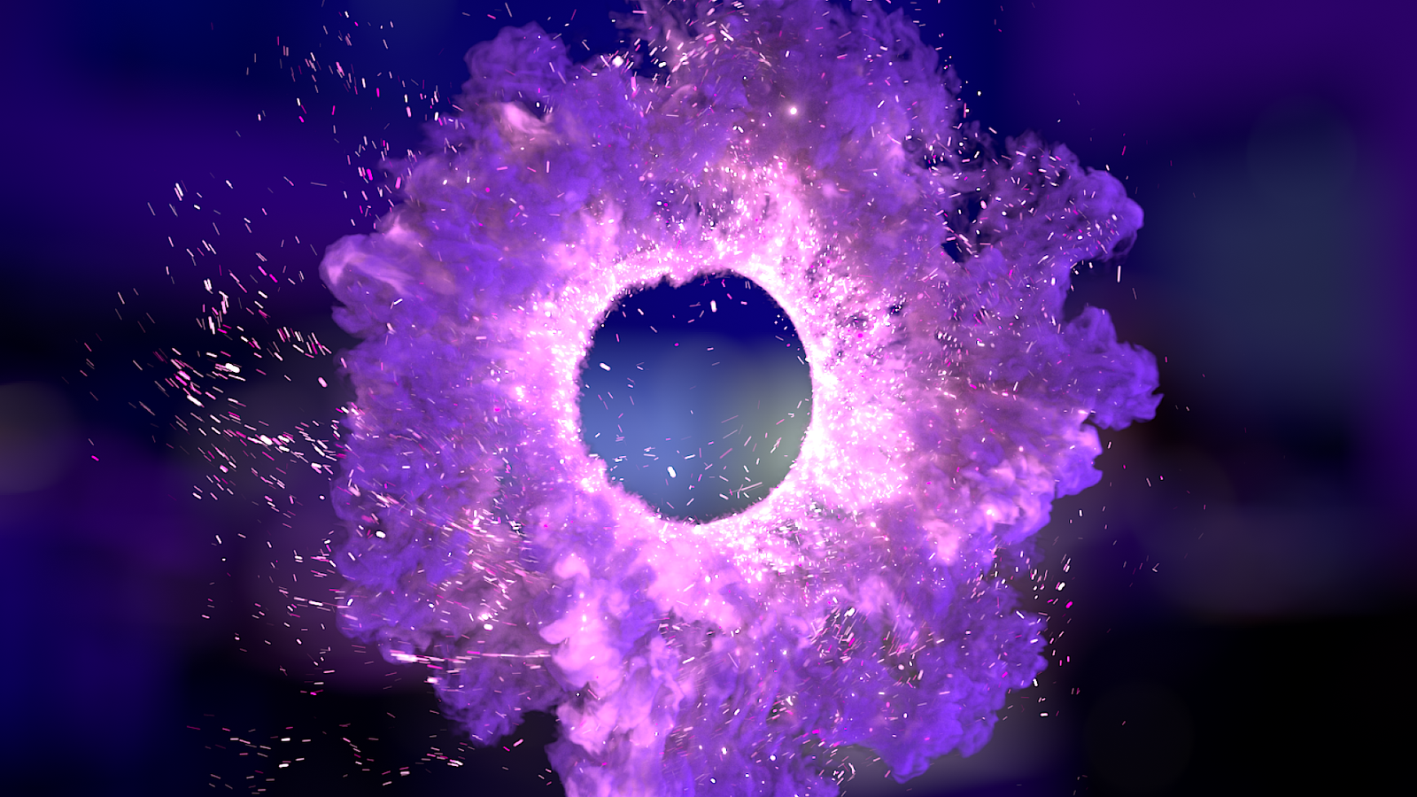
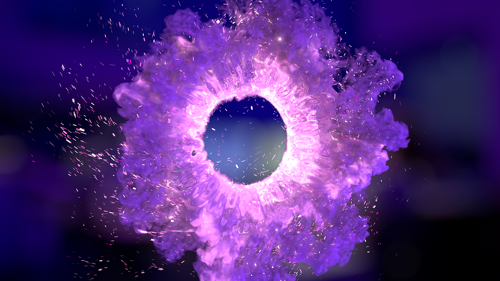
There have been many versions of the portal. Literally VERY many for the time allotted for the project, but in spite of everything — we coped and the customer was extremely pleased with the final version of the portal, which you can see in the advert.
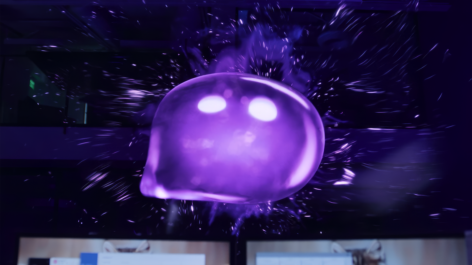
06. CG Character
Character creation, in total, took one day. This was probably the most exciting stage of the work, as no one really understood what the creature should look like. What you can see in the final version is nothing more than a coincidence that everyone liked.
Anyway, we had a rough idea in the form of a sketch from the director and a pad from the Postscript.io office that we needed to finalize.
One of the first thoughts regarding the material the character would be made of was jelly. Anyway, we started with something similar to Gummy Bears. Also, since the character had lines to say, to avoid making his mouth look creepy, we opted for a slight internal glow when the character is talking.

Even though we made the character pretty quickly, showing all the iterations would be crazy, as there are over 30 versions, some of which are only different when placed in front of a colored background. So, I’ll tell you the key steps that brought the logo to its final form.
Modeling & Materials
There were no problems at all with the modeling part. The only thing that really required some modifications was the logo tail. We didn’t want it to look sharp, but we didn’t want to smooth it out too much either.
The material, in turn, made us reconsider many variations of different densities, internal roughness, reflectivity and light transmission. We wanted to keep the translucency of the material, but make it dense enough that it distorted the space behind it beautifully. At the same time, so that the internal glow doesn’t look foreign.
Shading
Basically, we used a pre-made HDRI map for the logo shading. But since the logo itself created additional glows, we had to simulate them with lamps in Cinema4D to get the correct highlights on the geometry of the surrounding objects.
Also, at first we wanted to bake the animation of the lights inside the logo, but later we found out that the replicas from the same frame would be different for the full and cut versions. For this reason, it was decided to place a light, almost imperceptible, glow in the Emission pass, and then refine it at the compose stage by adding intensity animation.
Eye animation
At first we had trouble making the eyes look “alive”. Since the eyes became the only indicator of the character’s emotions, we had to make them as expressive as possible and convey the character’s personality.
Because of the tight deadlines, we could not afford to look for an animator who would draw the animation of the eyes frame by frame. Therefore, it was decided to draw softness to the eyes over ready, at that time, shape animation. It took much less time than drawing from scratch, while we were able to get bright, expressive and emotional eyes.
Eventually, after many iterations, the logo came to look like this: (below are the views of the logo with and without the internal illumination turned on).
07. CG Compositing
Portal Refinement
This is probably the only interesting part of the compositing process for you, and it was for us too, as we had to refine the portal to give it a plasma burning effect. Initially, we had a few thoughts on how to make this effect as fast as possible, as the project was done in a big hurry. That’s what I’m going to tell you about.
The obvious solution for our team was to use methods through distortion. First of all we started creating black and white maps from the standard Noise node trying to make the most similar effect to plasma burning.
First and foremost, my team and I would like to thank Pixelfudger for probably the best distortion tool we’ve ever tried.
The PxF_Distort node was the most perfect solution that allowed us not to spend a colossal amount of time on the technical part, but to get straight to the creative part.
Creating a noise map
At this stage, we were solely interested in creating a radial noise map that would give us the ability to draw the distortions emanating from the centre of the portal.
All in all, it was not a difficult task. Although, later on, we resorted to animating it to make it more realistic.
Creating masks
It’s also a pretty self-explanatory process. We needed to limit the area of distortion from plasma burning, so only the centre of the portal was selected.
Here we have animated the shift of the portal centre taking into account the camera displacement with the subsequent change in perspective.
Adjusting PxF_Distort
After a couple of hours of playing with the settings of the noise map and the PxF_Distort node, we came to the result you can see in the final version of the advert. We managed to make this effect easy and intuitive, without visual overloading of the image.
When I say we made multiple choices, I mean we made VERY many choices. What took us the most time was exactly adjusting the animation of the effect to match the change of the portal in perspective.
By selecting the optimal distortion map settings, we managed to make such a variant of plasma burning, which you can see in the final version of the advert.
Perhaps that was the last thing I wanted to talk about in such detail. But still I can’t leave out the work on the beautiful logo of the AI assistant ‘Postscript’.
Logo Refinement
We truly adore this character. The amount of effort and time it took to create the animation of his eyes – made him literally a part of each and every one of us. But there was another important part – working with the inner glow of the logo.
We can’t say there’s been some Herculean work done here. At the stage of creating the 3D model – we initially created a very light and barely noticeable glow, which we placed in the emission pass. Then, the work was solely animating the intensity values of the glow depending on the emotional content of the lines spoken by the logo.
This concludes the parsing of the creation of this work. We have deliberately left out unimportant steps such as the light fixture wedge and additional distortion work on the background behind the logo and around the portal so as not to repeat ourselves. The same principles were used, which can be repeated endlessly and uselessly.
Only a week was allotted for the project, there was hardly any time. In just a couple of hours my team and I made eight camera tracks with geometry of scenes and objects in them. Then we started cleanup and numerous roto-masks.
The final renders of the character and portals came just before the deadline. We had no more than a day for all the shots of the above video and the two short versions, the shots in which are fundamentally different from the long version.
It was incredibly interesting and cool to work on this project! We are grateful for the collaboration between Postscript.io and Portal Graphics and look forward to more future projects!
Special thanks to our team:
Piddubnyi Maksym
Artem Malakhov