Cyprus Invest
CATEGORY: Design
SERVICES: Branding
WEBSITE: cyprus-invest.estate
01. The Task
Develop a brand identity and visual language for a newly established company providing real estate investment services in Northern Cyprus. The client had been working with leading regional developers for several years and, due to business expansion, decided to launch an independent brand with long-term international ambitions.
Our task was to create a contemporary design system that would stand out from the saturated real estate market while remaining scalable and adaptable for future entry into other countries.


02. Scope of Work
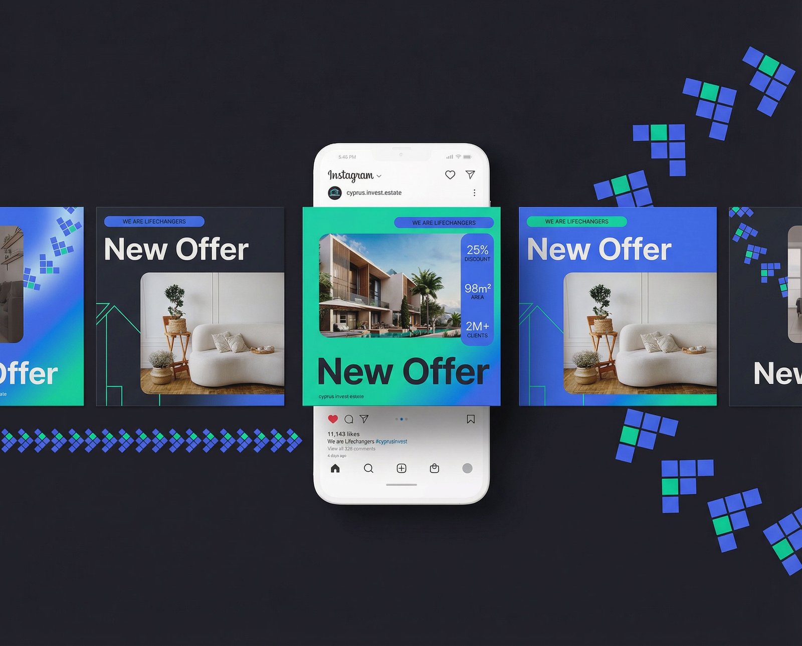
- Development and approval of the logo, color palette, and overall brand style aligned with the positioning statement “We are lifechangers.”
- Creation of a unified visual content system for social media and the website.
- Design of a comprehensive brand book to ensure consistent brand representation across all platforms and touchpoints.
03. Result
During the branding process for Cyprus Invest, the team focused on forward-looking design trends and insights from Pantone’s color research. As a core visual foundation, two key colors were selected: Royal Blue and Caribbean Green, reflecting trust, growth, and a strong connection to the region.
The visual system follows 2024 design trends, combining bold saturated colors with subtle grainy gradients and minimal graphic elements used as supporting accents.
When developing the logo, special attention was paid to brand uniqueness, target audience, and market context. The symbol is based on a simplified house form constructed from the abbreviation CIE – Cyprus Invest Estate, making it both intuitive and memorable.
The logo system was designed to be scalable: as the project grows and new sub-brands appear, the initial letter can be adapted without disrupting the overall structure. A symmetrical composition and geometric typography ensure flexibility, consistency, and long-term relevance.
Good evening. Excellent work – especially this visual style!
– Representative of Cyprus Invest
Simplicity in design is the key to clarity and understanding. Through minimalism, we create space for precision and balance, where every line and color serves a clear purpose. Behind simple forms lies a wide range of possibilities. One of the most fundamental and stable design shapes is the square, which becomes the foundation for building a flexible visual system.
By exploring variations of this core form, we developed additional graphic elements that extend and complement the main design language. One of these variations takes the shape of steps, symbolizing growth and progress. Without the central element – the green square representing Cyprus Invest – reaching the next level becomes impossible, reinforcing the idea of stability as a starting point for development.
Another variation transforms the stepped structure into a forward-pointing arrow, rotated at a 45-degree angle. This element plays a key role in logo animation, where new steps emerge from a single square and gradually evolve into directional lines, visually guiding the viewer forward.
The third element is a circular form constructed from arrows. It serves as a secondary graphic element, softening the strictness of the core shapes. This form is inspired by Cypriot mosaic patterns, where circular elements are commonly found, adding cultural context and visual rhythm to the overall identity.


By combining and rotating the core color palette, we created a minimum of four layout variations from a single template, allowing for visual diversity across the project’s social media presence. Paired with photography and minimal graphic overlays, this approach results in visuals that are bold and impactful while remaining clean and uncluttered.


Building a strong and recognizable brand is not just a business requirement, but an opportunity to stand out, create meaningful connections with the audience, and leave a lasting impression.
Modern design trends allow brands to differentiate themselves from competitors who often rely on overly corporate visuals, unintentionally creating a barrier between the brand and its audience. This approach can make professionalism feel distant rather than accessible.
We proposed a solution that resonates both with large-scale investors and clients with smaller budgets. Brightness, simplicity, and trust became the core principles translated through design.
The audience notices the brand through bold visual elements in their feed.
The website experience is intuitive, allowing users to quickly find the information they need.
Trust is reinforced through clear communication, service quality, and transparent collaboration terms.